Product configurators sit at the intersection of complexity and commerce. Unlike a standard product page where a customer chooses a size and clicks "Add to Cart," a configurator asks them to make a series of meaningful decisions: material, colour, dimensions, features, finishing, engraving. Each decision carries weight. Each step introduces the possibility of confusion, hesitation, or abandonment. The UX of your configurator isn't a nice-to-have detail. It is the single biggest determinant of whether those high-intent visitors convert into paying customers.
Consider the stakes. Research from webmakers.expert found that well-implemented product configurators can increase conversion rates by up to 40%, while the Baymard Institute estimates that better UX design alone can boost conversion rates by 35.26% for large e-commerce sites. But the reverse is equally true: 23% of customers abandon their carts due to an overly complicated purchase process. In the configurator context, where the process is inherently more complex than standard shopping, that percentage can climb dramatically if the experience isn't carefully designed.
This article distils the UX principles that separate high-converting configurators from the ones customers abandon mid-flow. Every recommendation is grounded in research, and every principle has been validated at scale.
Progressive Disclosure: Don't Overwhelm, Guide
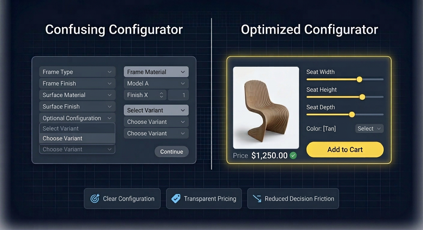
The most common mistake in configurator design is presenting every option at once. A customer configuring a custom desk doesn't need to see wood species, leg style, cable management, drawer configuration, surface treatment, and edge profile simultaneously. That volume of choice triggers what psychologist Barry Schwartz calls the "paradox of choice" and what cognitive science frames as excessive cognitive load.
Progressive disclosure, a principle first articulated by IBM researcher J.M. Keller and later formalised by the Nielsen Norman Group, solves this by revealing options in stages. The customer makes one decision, sees its impact, and then moves to the next. Research from the Interaction Design Foundation confirms that progressive disclosure improves three of usability's five core components: learnability, efficiency, and error rate. Cognitive psychologist George Miller's foundational research established that our working memory can hold roughly seven items (plus or minus two) at any given time. A configurator that respects this limit converts. One that ignores it loses customers.
In practice, this means structuring your configurator as a guided sequence: start with the broadest, most impactful choice (the base model or category), then progressively narrow to finer details (finish, accessories, personalisation). Each step should feel like a natural progression, not a form to be endured. This is also why the psychology of customization favours step-by-step flows: each completed step deepens the customer's investment in the product they're creating.
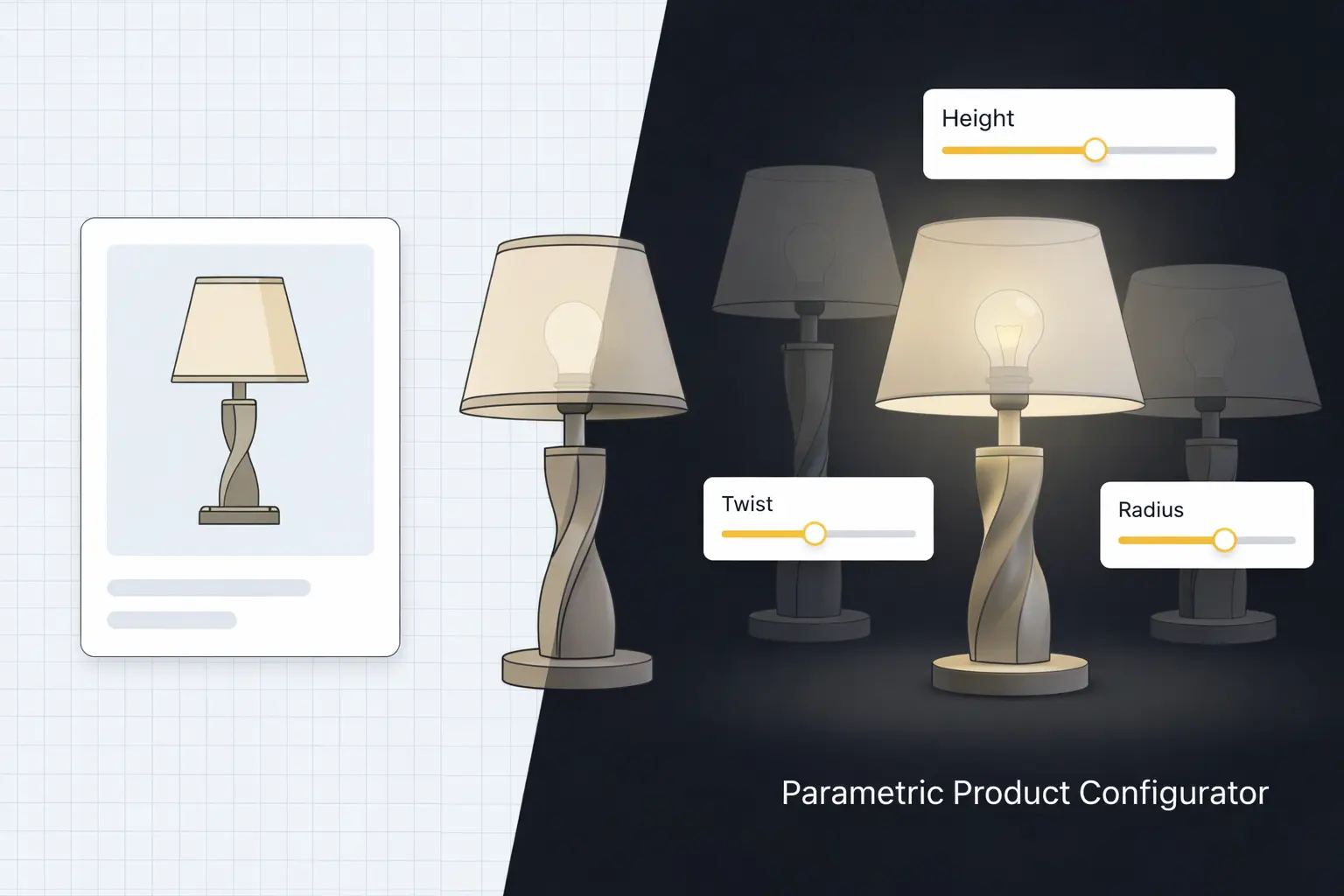
Real-Time Visual Feedback: Every Change, Instantly Reflected
When a customer selects walnut over oak, they need to see the difference immediately. Not after a page reload. Not after clicking "Preview." Instantly. This principle is non-negotiable for high-converting configurators, and the data explains why.
A collaborative study with Google found that a mere 0.1-second improvement in page load time increases conversions by 8.4% in e-commerce and 10.1% in travel. Extrapolate that to the dozens of interactions within a configurator session, and the compounding impact of instant feedback becomes clear. Conversely, research shows that every additional second of load time reduces conversions by 4.42%, and on mobile, a one-second delay can cost up to 20% of conversions.
Real-time visual feedback also reinforces trust through visualization. When a customer sees a photorealistic rendering update instantly, they trust that what they're designing is what they'll receive. This trust is the bridge between configuration and purchase. Without it, even the most beautiful product won't convert, because the customer can't be sure the final product will match their expectations.
Mobile-First Design: Where Your Customers Actually Are
Mobile commerce now accounts for 60% of all global e-commerce sales, generating over $4 trillion annually. Mobile devices drive 78% of e-commerce traffic, and that share continues to grow. Yet many configurators are still designed desktop-first, with touch targets too small for thumbs, 3D viewports that don't respond to pinch-to-zoom gestures, and option panels that require horizontal scrolling on narrow screens.
Designing a configurator for mobile isn't about shrinking the desktop experience. It requires rethinking interaction patterns entirely. Touch targets should be a minimum of 44x44 pixels (Apple's Human Interface Guidelines). Swipe gestures should control model rotation. Option selection should use bottom sheets and carousels rather than dropdown menus. And the 3D viewport should claim at least 50% of screen real estate at all times, because if the customer can't see the product they're designing, they won't finish designing it.
The choice between 2D and 3D configurators also has mobile implications. A well-optimised 3D configurator using compressed textures and efficient mesh decimation can run at 60fps on mid-range smartphones. A poorly optimised one will stutter, drain batteries, and lose customers. Mobile performance isn't a technical afterthought. It's a conversion lever.
Guided vs. Freeform Configuration Flows
Should your configurator walk customers through a fixed sequence of steps, or let them jump freely between options? The answer depends on your product's complexity and your audience's expertise.
For most consumer-facing products, guided flows outperform freeform approaches. A guided flow reduces decision fatigue, prevents invalid configurations, and creates the step-by-step investment that drives psychological ownership. Each completed step narrows the remaining choices, making the next decision easier.
Freeform configuration works best for expert users and B2B contexts where the buyer already knows what they want and needs efficiency over hand-holding. Even in freeform modes, however, providing a recommended starting sequence and visual indicators of completion status improves conversion. The goal is to offer freedom without disorientation.
Error Prevention Over Error Correction
A customer who configures a glass tabletop that's 2 metres wide but only 6mm thick shouldn't be allowed to add it to cart and then be told it's not feasible. That's error correction, and it destroys trust. Instead, the configurator should prevent the invalid configuration from ever being created: dynamically constraining available options based on prior selections, greying out incompatible choices, and providing contextual explanations for why certain combinations aren't available.
This is one area where many businesses make costly mistakes. Every post-configuration rejection, whether it's an "invalid combination" error at checkout or a customer service email explaining why their design can't be manufactured, represents a conversion lost and a customer frustrated. Smart constraint logic, built into the configurator from the start, eliminates these scenarios entirely.
Clear, Real-Time Pricing Feedback
The Baymard Institute's research on cart abandonment is unambiguous: 48% of customers who abandon their carts cite unexpected costs as the primary reason. In a configurator, where each option selection can change the final price, this risk is amplified. If the customer configures a product for ten minutes and only discovers the price at the end, sticker shock is almost guaranteed.
The solution is real-time pricing that updates with every selection. The customer should always know the current total and how each option affects it. Price deltas ("+$45 for premium leather") are more effective than absolute prices because they frame the decision as an incremental upgrade rather than a total cost recalculation. This transparency doesn't suppress sales. It builds confidence. Customers who understand the price at every step are far less likely to abandon at checkout, because there are no surprises left.
Loading Performance and WebGL Optimisation
A configurator that takes eight seconds to load will lose more than half its visitors before they interact with a single option. Google's research found that 53% of mobile users leave a page that takes longer than three seconds to load, and the probability of bounce increases 123% as load time goes from one to ten seconds.
For WebGL-based 3D configurators, performance optimisation involves several layers: model polygon reduction (aim for under 100K triangles for consumer-facing products), texture compression using formats like KTX2 and Basis Universal, progressive loading that shows the model at low detail first and upgrades in the background, and efficient use of GPU instancing for products with repeated elements. Lazy-loading non-visible options and caching previously loaded textures further reduces perceived wait times.
Accessibility: The Overlooked Conversion Lever
Twenty-six percent of US adults have a disability, and globally, people with disabilities and their families control approximately $13 trillion in annual disposable income. Research shows that 82% of customers with disabilities would spend more with businesses offering accessible experiences, and accessible checkout processes achieve 35% higher completion rates than inaccessible alternatives.
For configurators, accessibility means ensuring keyboard navigability through all options and steps, providing text alternatives for visual changes ("Selected: Walnut finish, dark brown tone"), maintaining sufficient colour contrast in UI controls, and supporting screen readers for step progression and price updates. These aren't edge-case accommodations. They're conversion optimisations that happen to also be the right thing to do.
How BeeGraphy's UI Framework Addresses These Out of the Box
Building a configurator that implements all these principles from scratch is a significant engineering undertaking. This is precisely why Configurator.tech, powered by BeeGraphy's platform, provides these UX best practices as built-in defaults rather than custom development tasks.
The platform's guided configuration flow implements progressive disclosure automatically: options are presented in logical steps, with each selection dynamically constraining the next set of choices. Real-time 3D rendering updates instantly with every option change, and the pricing engine recalculates and displays the total as the customer configures. Mobile responsiveness, touch interaction support, and WebGL performance optimisation are handled at the platform level, not the project level.
Constraint logic prevents invalid configurations before they happen, eliminating the need for post-checkout rejections. And because the rendering engine is optimised for consumer-grade hardware, even complex products load and run smoothly on mid-range smartphones.
Explore our pre-built configurator templates to see these principles applied across industries, review our pricing plans to find the right fit for your business, or get in touch to discuss a custom implementation tailored to your product line.
UX Is the Conversion Strategy
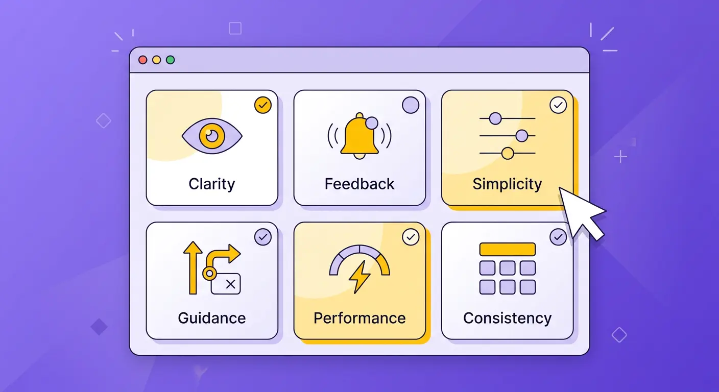
The highest-converting configurators don't succeed because they have more features or flashier visuals. They succeed because every interaction is designed to reduce friction, build confidence, and sustain momentum from first click to checkout. Progressive disclosure manages complexity. Real-time feedback sustains engagement. Mobile optimisation meets customers where they are. Transparent pricing prevents abandonment. Accessibility expands your market.
None of these principles are revolutionary in isolation. Their power lies in their combination and consistent execution. A configurator that nails seven of the eight and drops the ball on loading performance will still lose customers. The goal is a holistic experience where no single element breaks the flow. When you achieve that, the conversion data speaks for itself.